
Sena Kim

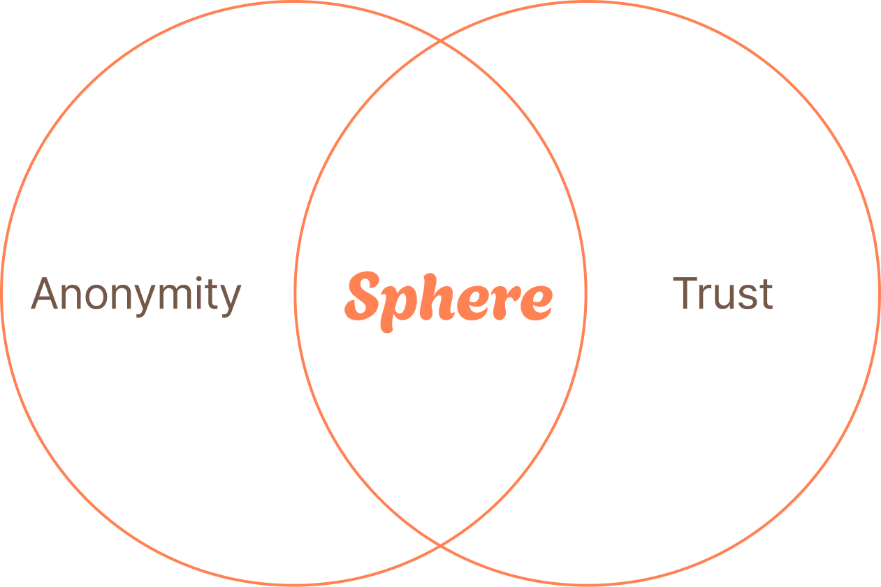
Sphere
University Student-Exclusive
Anonymous Community & Marketplace & Career Info App
Sphere
The Exclusive Social Networking Platform for University Students
Overview
"Bridging the gap between academic collaboration, social networking, and personal growth in a safe, verified environment."
In an era saturated with general-purpose social media and dating apps, students lack a safe space dedicated solely to their campus life. Sphere is a hyper-local social platform exclusively for verified university students. By requiring student verification, we ensure a genuine community where users can balance anonymity for casual talk with real-name profiles for professional networking and safe transactions.
OverView
Background
From Student Council to Sphere: Designing for Inclusion
While serving as Student Council Vice President at SVA, I witnessed a hidden problem behind the lively campus life: Social Isolation.
I noticed that transfer and international students often faded into the background, struggling to break into tight-knit groups. The lack of a central communication channel wasn't just an inconvenience—it was a barrier to belonging. I started Sphere with a simple wish: to build a digital bridge where every student, regardless of their background, can feel seen, heard, and connected.

Design Process
I approached this project strategically: first by identifying market gaps through competitor analysis, then formulating a 'Hybrid Identity' hypothesis, and finally validating it through user research before diving into design."
Market Analysis
Strategy Definition
Hypothesis Validation
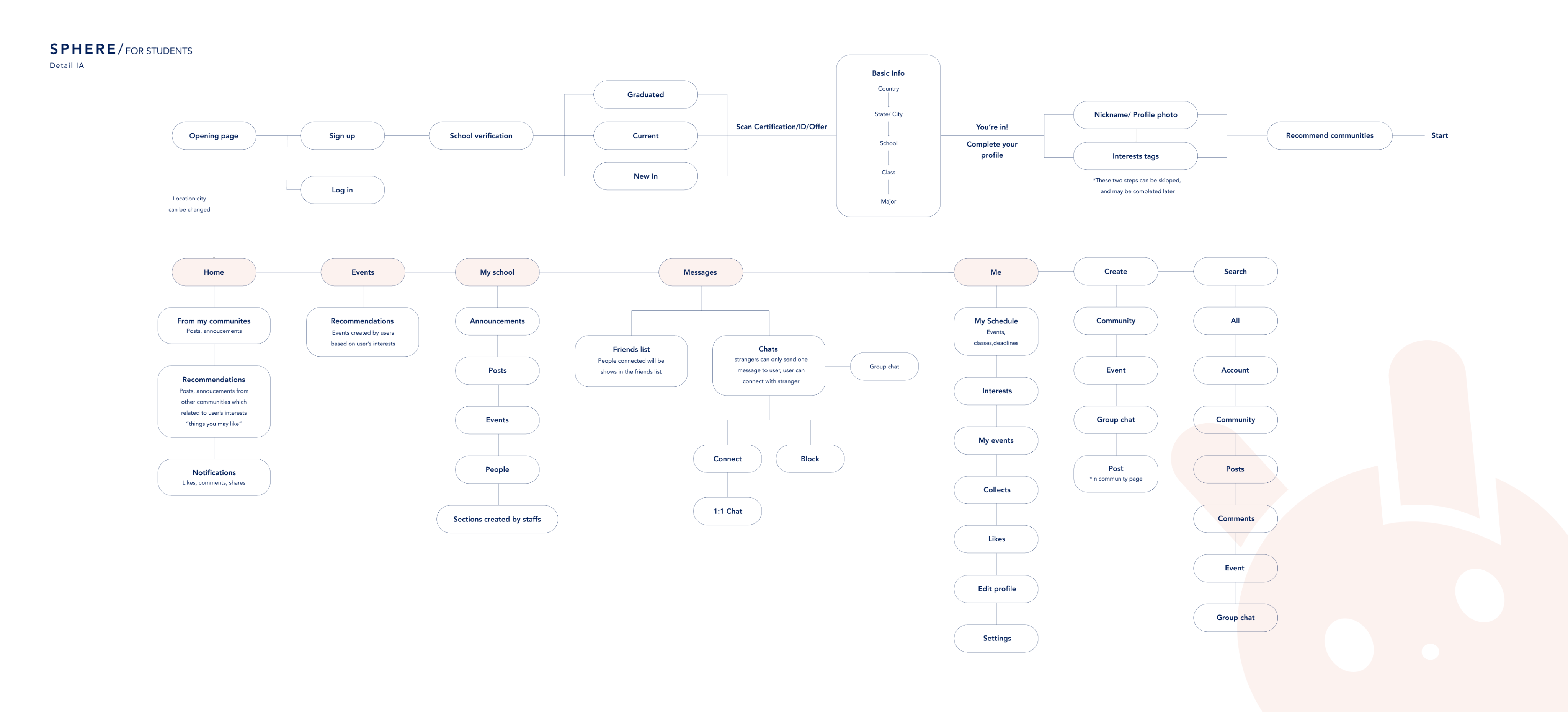
Information Architecture
Design

Research & Competitor Analysis
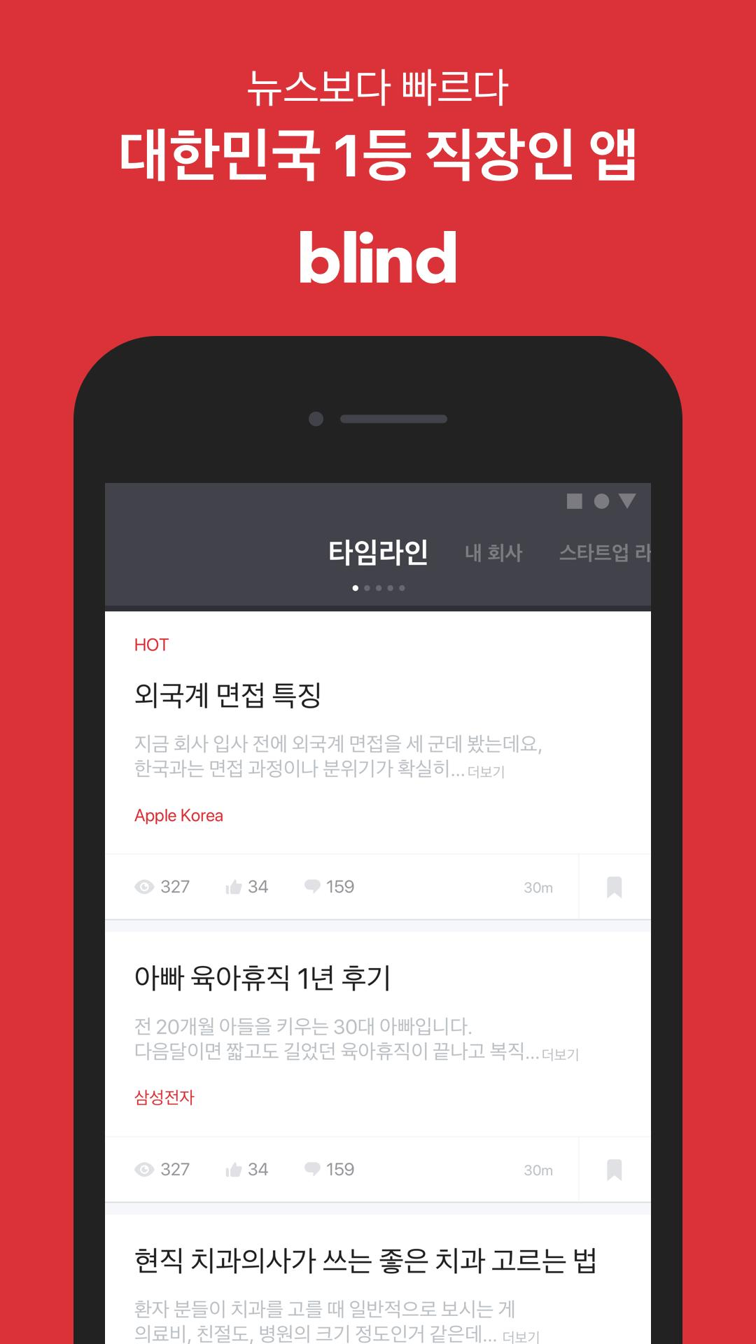
Blind
Verified Anonymity
Adopting the structure of a trusted anonymous community where accountability is guaranteed through authentication, fostering honest yet responsible discussions.
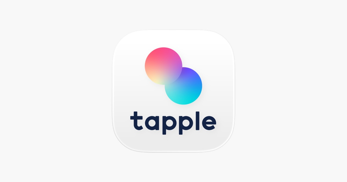
Tapple
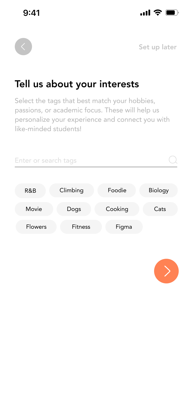
Safe Interest Matching
Prioritizing privacy by connecting users based on shared interests and hobbies rather than personal data, ensuring a secure social environment.
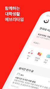
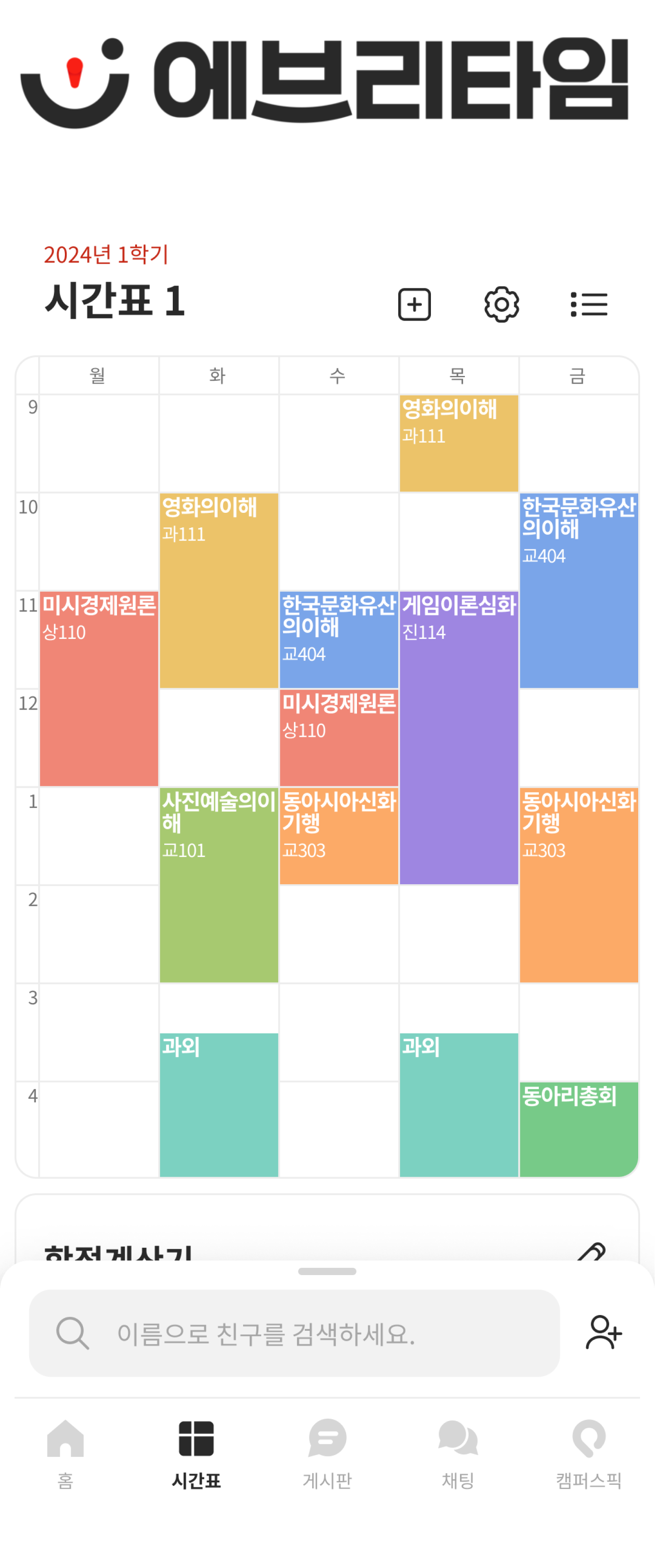
Every Time
Utility-Driven Engagement
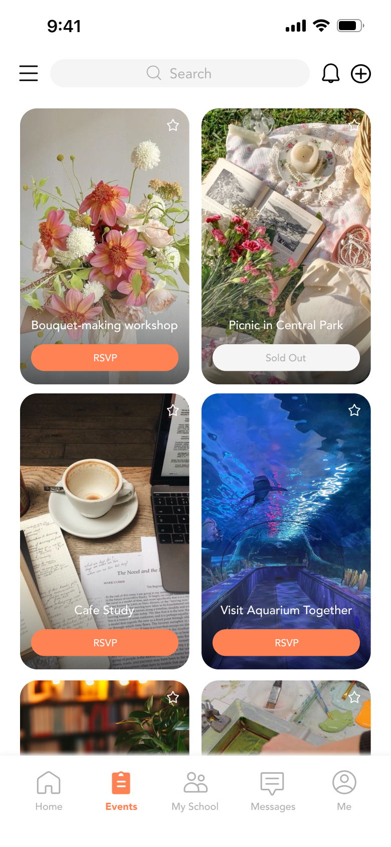
Leveraging essential academic tools (like class schedules) as a hook to attract students, naturally expanding into a hyper-local campus community."
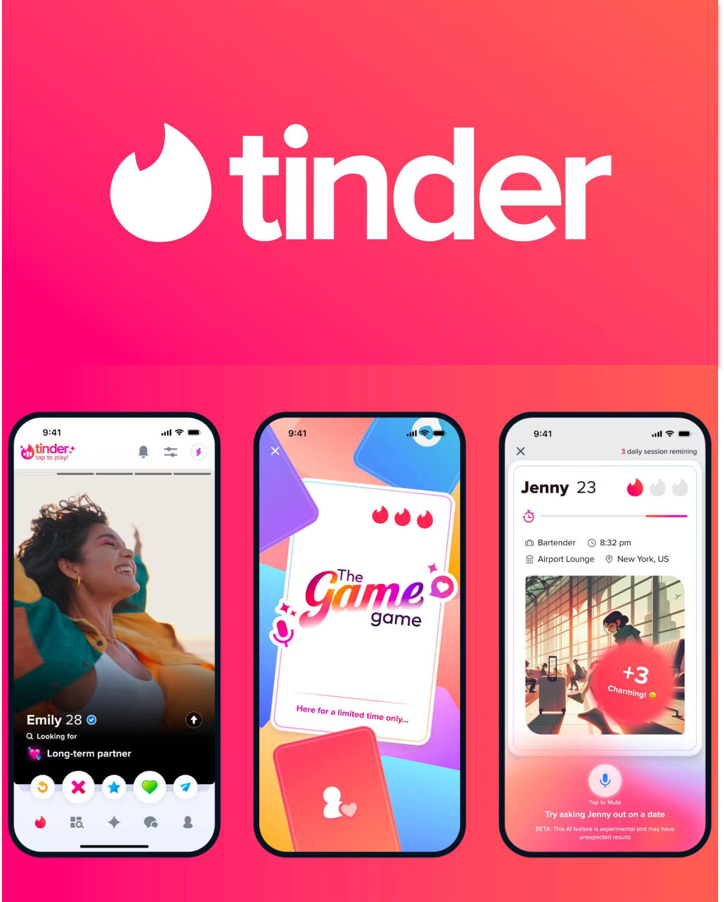
Tinder
Pain Point to SolveThe Limit of Closed 1:1 InteractionMoving beyond the isolation of closed, one-on-one dating apps by creating an open 'Community Square' where students can mingle freely before connecting privately."
Core Strategy
The Hybrid Model
Anonymous for Comfort, Real Name for Trust
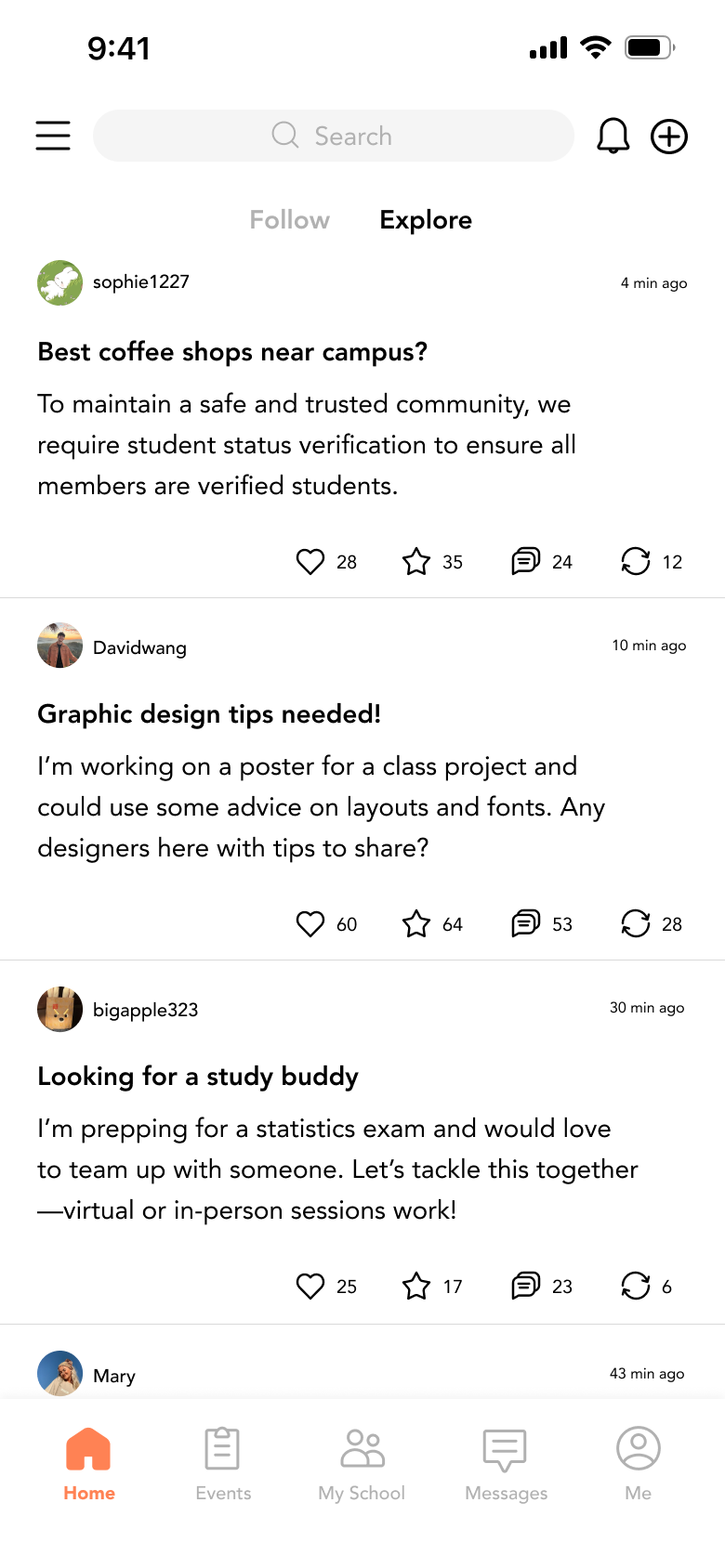
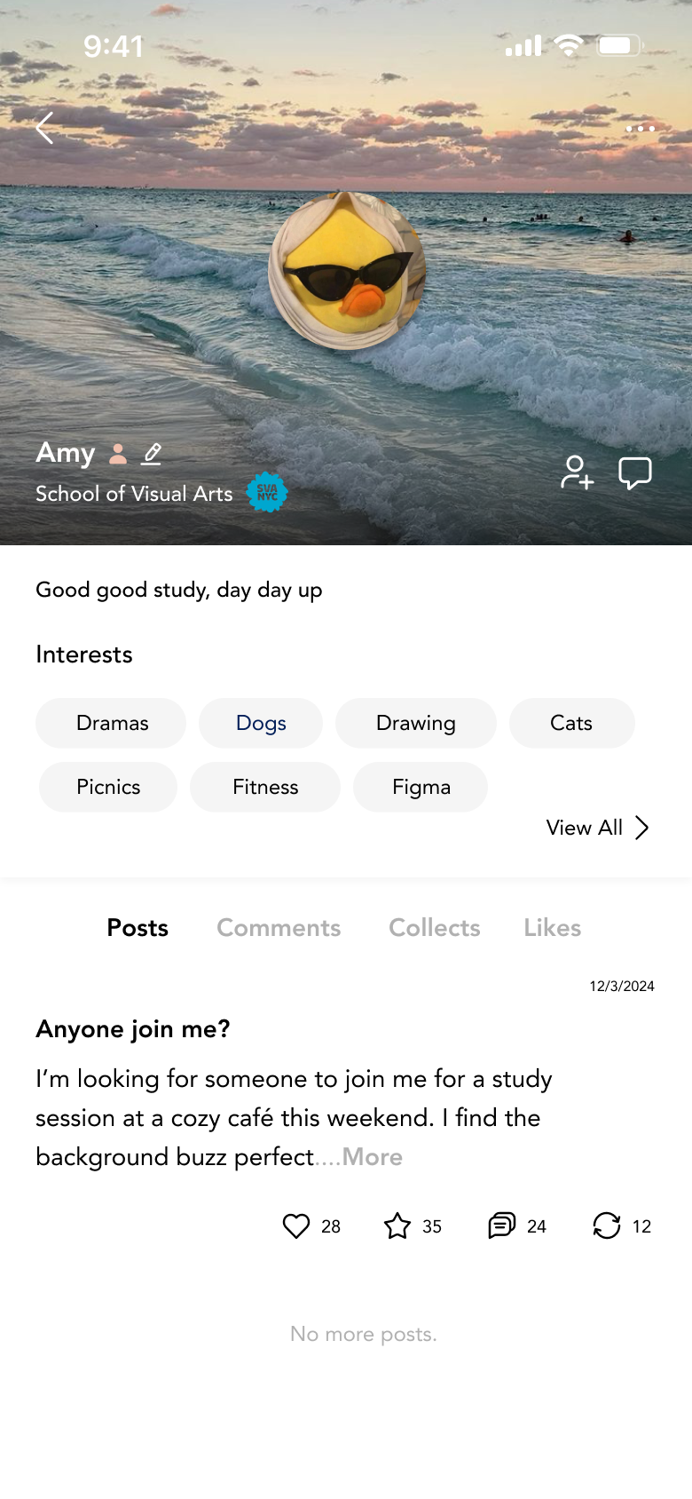
Start Anonymously: Users can post freely on general boards to discuss sensitive topics or ask questions without pressure.
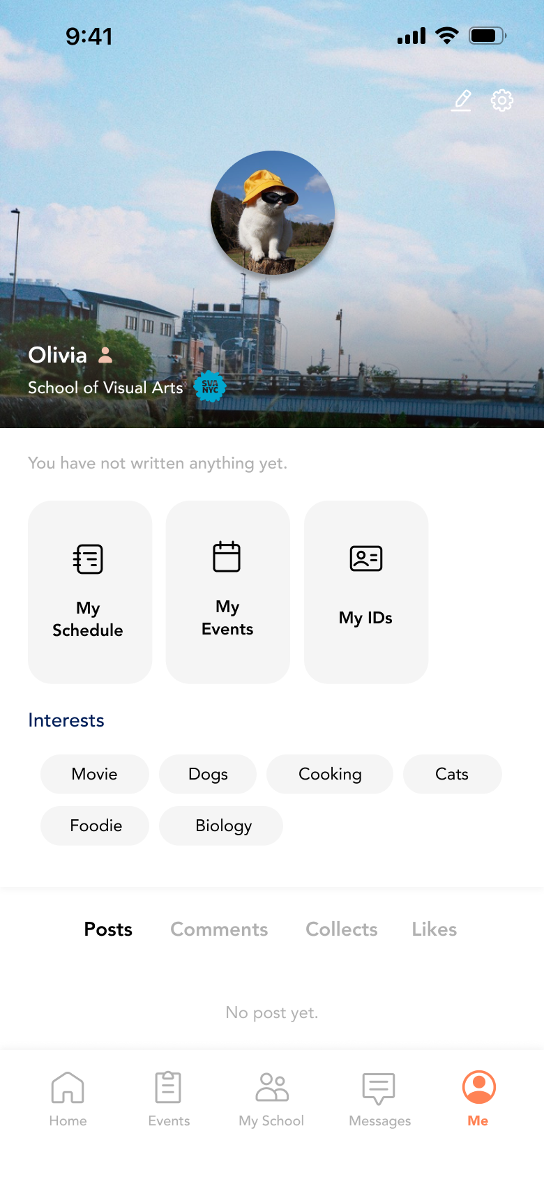
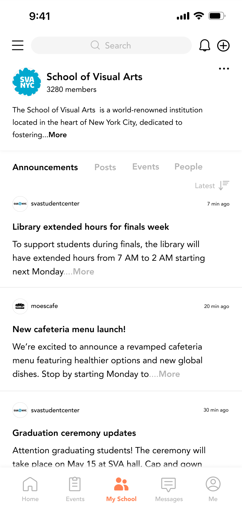
Reveal Identity: When networking for jobs, team projects, or selling items, users can switch to their verified real-name profile to build credibility.
Research
Hypothesis-Driven
Research Design
My goal was twofold: to confirm if solving two co-existing pain points would satisfy user needs, and to explore beyond my initial assumptions by listening to real user stories for unexpected ideas.
I designed the user research based on a hypothesis of two hybrid strategies. The core assumption was that addressing two intersecting pain points within the same domain would effectively solve the users' underlying needs. Additionally, the interviews were structured to uncover 'unknown unknowns’ gathering authentic user voices and related insights that I had not previously anticipated.
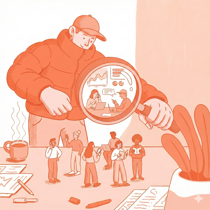
Research Goals
After setting goals for what content to verify, we began conducting user research.
Validate the "Hybrid" Need
To verify if students truly need a flexible system that switches between 'Anonymous Comfort' and 'Verified Trust' depending on the context."
Identify Friction Points
To identify the 'Switching Costs' and frustrations students face when juggling multiple disjointed apps (e.g., Blind, LinkedIn, Facebook) for a single campus life.
Discover Hidden Needs
To go beyond known features and collect 'Unknown Unknowns'—the subtle yet critical inconveniences in daily university life that existing tools fail to address.
After setting goals for what content to verify, we began conducting user research.
Research Insights
Key Question & Voice

"I once posted about my anxiety regarding internships on an anonymous board, hoping for genuine advice. But half the comments were trolls, and the other half felt like fake information. I want honesty, not toxicity."
“It’s annoying to switch between apps constantly. I check my class schedule on one app, DM friends on Instagram, and look for textbooks on Facebook. Why isn't there one app where I can do all of this with people from my school?”
Consistent feedback from multiple participants.
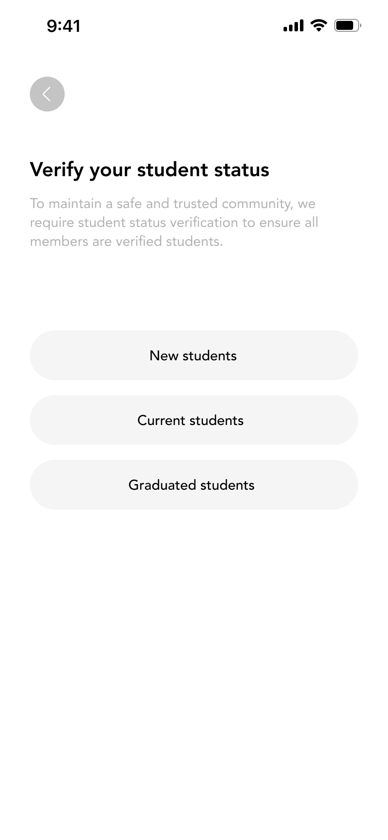
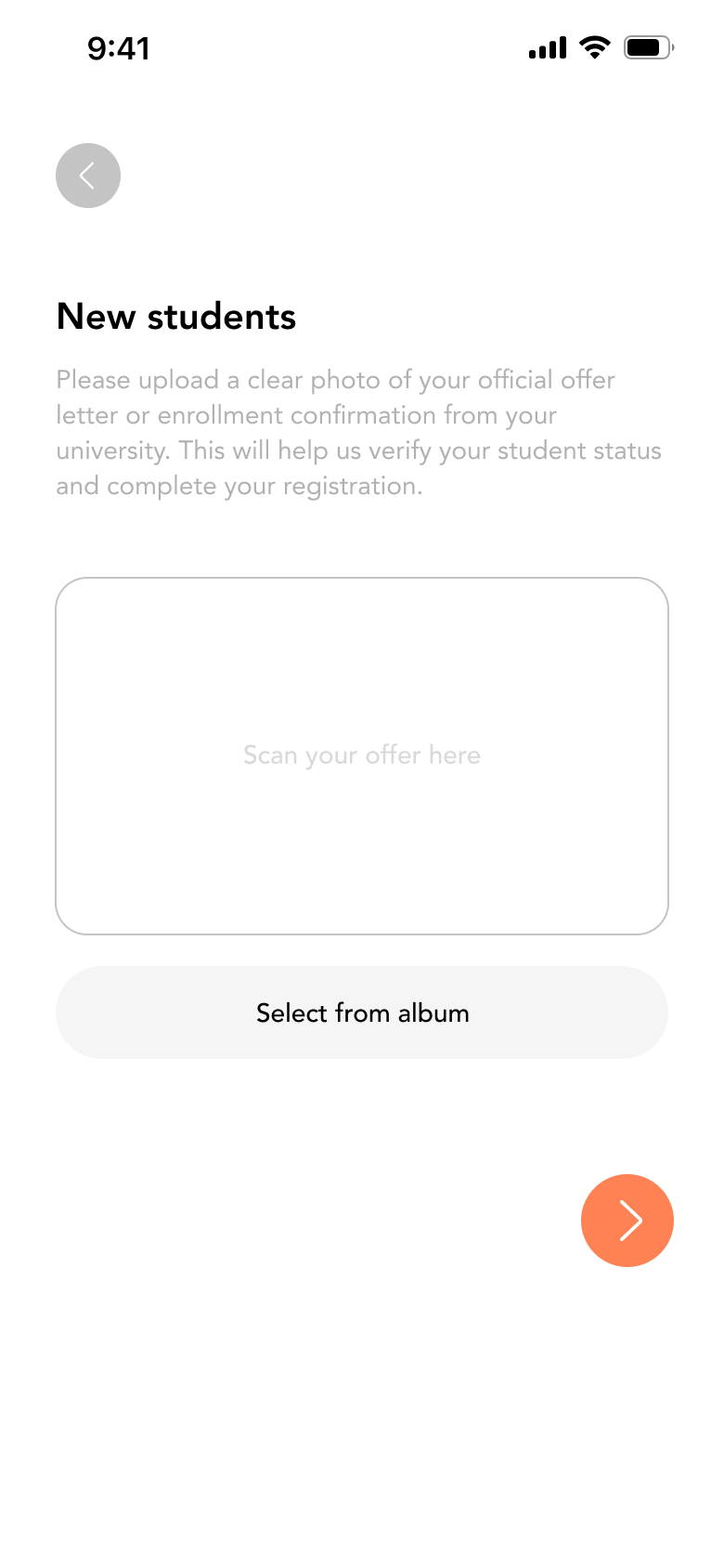
“Trying to find a roommate on Craigslist was a nightmare. I had no idea if the person was actually a student or a total stranger. If I could just see a 'Verified Student' badge next to their name, I would feel so much safer.”
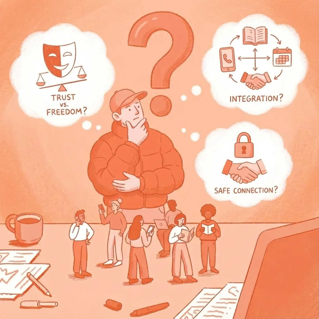
How might we
Trust vs Freedom
How might we design a community that offers the comfort of anonymity while guaranteeing the credibility of verified students?
Safe Connection
Broad marketplaces pose safety risks (scams), making students hesitant to find roommates or buy textbooks from strangers
Integration
How might we integrate fragmented campus interactions into a single ecosystem to reduce switching costs and build a cohesive student culture?
Expected Outcome
"Through this research, I aim to map out the 'User Journey of Trust'—identifying exactly when a student wants to wear a mask (Anonymity) and when they want to show their badge (Verification). This will help define the optimal UX flow for switching between the two modes."

Sena Kim
Sphere
University Student-Exclusive
Anonymous Community & Marketplace & Career Info App
Sphere
The Exclusive Social Networking Platform for University Students
Overview
"Bridging the gap between academic collaboration, social networking, and personal growth in a safe, verified environment."
In an era saturated with general-purpose social media and dating apps, students lack a safe space dedicated solely to their campus life. Sphere is a hyper-local social platform exclusively for verified university students. By requiring student verification, we ensure a genuine community where users can balance anonymity for casual talk with real-name profiles for professional networking and safe transactions.
OverView
Background
From Student Council to Sphere: Designing for Inclusion
While serving as Student Council Vice President at SVA, I witnessed a hidden problem behind the lively campus life: Social Isolation.
I noticed that transfer and international students often faded into the background, struggling to break into tight-knit groups. The lack of a central communication channel wasn't just an inconvenience—it was a barrier to belonging. I started Sphere with a simple wish: to build a digital bridge where every student, regardless of their background, can feel seen, heard, and connected.
Design Process
I approached this project strategically: first by identifying market gaps through competitor analysis, then formulating a 'Hybrid Identity' hypothesis, and finally validating it through user research before diving into design."
Market Analysis
Strategy Definition
Hypothesis Validation
Information Architecture
Design

Research & Competitor Analysis
Blind
Verified Anonymity
Adopting the structure of a trusted anonymous community where accountability is guaranteed through authentication, fostering honest yet responsible discussions.
Tapple
Safe Interest Matching
Prioritizing privacy by connecting users based on shared interests and hobbies rather than personal data, ensuring a secure social environment.
Every Time
Utility-Driven Engagement
Leveraging essential academic tools (like class schedules) as a hook to attract students, naturally expanding into a hyper-local campus community."
Tinder
Pain Point to SolveThe Limit of Closed 1:1 InteractionMoving beyond the isolation of closed, one-on-one dating apps by creating an open 'Community Square' where students can mingle freely before connecting privately."
Core Strategy
The Hybrid Model
Anonymous for Comfort, Real Name for Trust
Start Anonymously: Users can post freely on general boards to discuss sensitive topics or ask questions without pressure.
Reveal Identity: When networking for jobs, team projects, or selling items, users can switch to their verified real-name profile to build credibility.
Research
Hypothesis-Driven
Research Design
My goal was twofold: to confirm if solving two co-existing pain points would satisfy user needs, and to explore beyond my initial assumptions by listening to real user stories for unexpected ideas.
I designed the user research based on a hypothesis of two hybrid strategies. The core assumption was that addressing two intersecting pain points within the same domain would effectively solve the users' underlying needs. Additionally, the interviews were structured to uncover 'unknown unknowns’ gathering authentic user voices and related insights that I had not previously anticipated.
Research Goals
After setting goals for what content to verify, we began conducting user research.
Validate the "Hybrid" Need
To verify if students truly need a flexible system that switches between 'Anonymous Comfort' and 'Verified Trust' depending on the context."
Identify Friction Points
To identify the 'Switching Costs' and frustrations students face when juggling multiple disjointed apps (e.g., Blind, LinkedIn, Facebook) for a single campus life.
Discover Hidden Needs
To go beyond known features and collect 'Unknown Unknowns'—the subtle yet critical inconveniences in daily university life that existing tools fail to address.
After setting goals for what content to verify, we began conducting user research.
Research Insights
Key Question & Voice
"I once posted about my anxiety regarding internships on an anonymous board, hoping for genuine advice. But half the comments were trolls, and the other half felt like fake information. I want honesty, not toxicity."
“It’s annoying to switch between apps constantly. I check my class schedule on one app, DM friends on Instagram, and look for textbooks on Facebook. Why isn't there one app where I can do all of this with people from my school?”
Consistent feedback from multiple participants.
“Trying to find a roommate on Craigslist was a nightmare. I had no idea if the person was actually a student or a total stranger. If I could just see a 'Verified Student' badge next to their name, I would feel so much safer.”
How might we
Trust vs Freedom
How might we design a community that offers the comfort of anonymity while guaranteeing the credibility of verified students?
Safe Connection
Broad marketplaces pose safety risks (scams), making students hesitant to find roommates or buy textbooks from strangers
Integration
How might we integrate fragmented campus interactions into a single ecosystem to reduce switching costs and build a cohesive student culture?
Expected Outcome
"Through this research, I aim to map out the 'User Journey of Trust'—identifying exactly when a student wants to wear a mask (Anonymity) and when they want to show their badge (Verification). This will help define the optimal UX flow for switching between the two modes."
